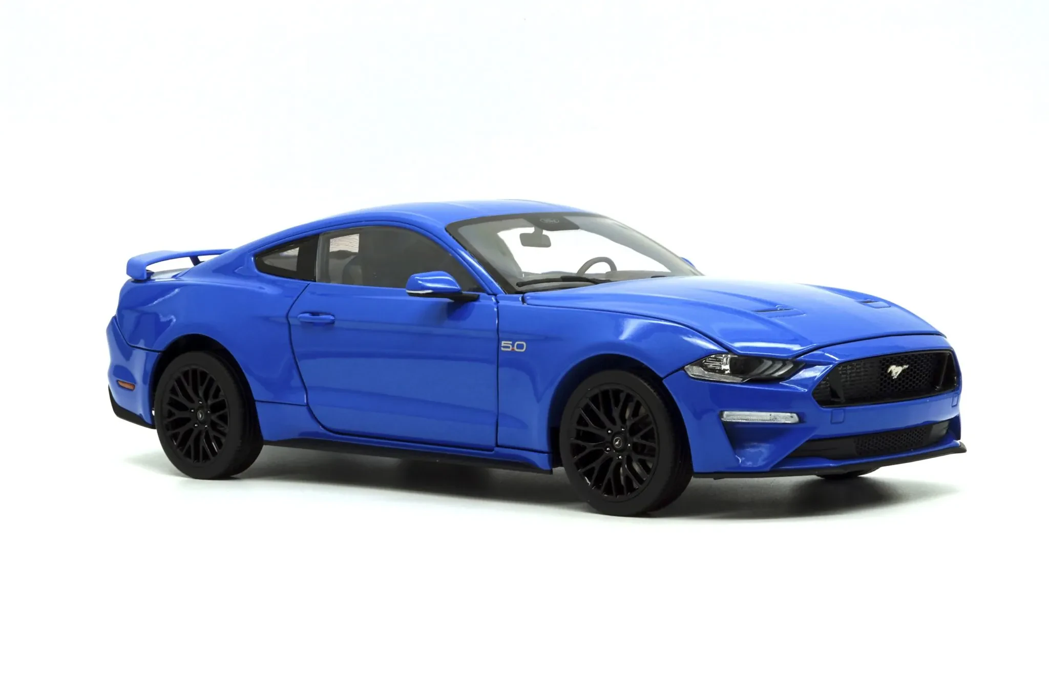
Those little emblems on your favorite diecast cars – they’re more than just tiny decorations. They’re a key part of what makes a diecast model appealing, historically significant, and, for many collectors, the whole point! This article delves into the fascinating world of diecast car logos, exploring their history, design, and the meaning they hold.
The History of Diecast Logos
Early diecast cars, often made in the mid-20th century, didn’t always have the detailed logos we see today. Many were simpler, relying on a basic brand name or a stylized emblem. As manufacturing techniques improved, so did the detail on the logos, allowing for more intricate designs reflecting the real-world car’s branding.

The evolution of diecast logos mirrors the evolution of automotive branding itself. Think about the classic simplicity of a vintage Ford logo compared to the more modern, complex designs found on today’s high-end cars. The same level of evolution is reflected in the logos used on their diecast counterparts.
Why Logos Matter to Collectors
For serious diecast collectors, the logo is crucial. An accurate and well-executed logo is a sign of a high-quality model. It’s a detail that speaks volumes about the care and attention to accuracy put into the manufacturing process. A poorly done logo can significantly reduce the value and desirability of a diecast car.
Moreover, the logo can tell you a lot about the model itself. Some manufacturers use different logos to represent different versions or years of a particular car, adding to the collector’s interest and challenge.
Types of Diecast Logos
Diecast logos come in all shapes and sizes. Some are simple embossed designs, while others are intricate, multi-colored decals. Some even utilize 3D elements for extra detail. The methods of application vary, too—some are painted on, others are tampo-printed (a kind of pad printing), and still others are tiny, almost microscopic decals.


Identifying Fake Logos
Unfortunately, the popularity of diecast cars means that counterfeit models are around. One of the first things counterfeiters often get wrong is the logo. Look for blurred lines, incorrect colors, or misspellings as indicators of a fake. A good, authentic logo should be crisp and accurately reflect the real car’s branding.
The Future of Diecast Logos
With technology continually evolving, we can expect ever-increasing levels of detail in diecast car logos. Improved printing techniques and the use of new materials could lead to even more realistic and intricate representations of car brand emblems.
Think about the potential for extremely fine detail, perhaps even incorporating light-reflective elements to mimic the real thing! The future is bright for the tiny details that add so much to our beloved diecast cars.
Things to Consider When Looking at Diecast Logos in 2024
- Accuracy: Does the logo precisely match the real car’s emblem?
- Clarity: Is the logo sharp and easy to see?
- Color: Are the colors accurate and vibrant?
- Application: Does the logo look professionally applied?
- Placement: Is the logo placed correctly on the model?
In conclusion, diecast car logos are more than mere decorations. They are a reflection of the car’s history, the model’s quality, and the collector’s passion. By paying attention to these small details, you’ll not only appreciate the models more but also enhance your ability to identify authentic collectibles.
